Requirements
For this tutorial you only need to have some basic understanding on React, the web (HTML, JS, CSS), and Markdown. I'll explain the details of NextJS and tailwindCSS as we go. If you don't know what a NextJS is or what tailwindCSS is all about, here's a brief explanation:
- NextJS: It's a framework built on top of react, it gives us functionalities out the box such as routing, optimization, static site generation, etc.
- TailwindCSS: A css framework based on utilities, it allows us to work faster without the need to write a lot of css, plus it's easily customizable.
Introduction
Creating your own litle space on the internet is a great idea. Not only does it serve as a personal archive, but also as a means to share your prowess with developers around the world. Nowadays there's a ton of different ways and tools to go about creating one, but remember, the tools you use to build it are less significant than the actual content. Here is a rough flowchart of how producing a blog looks like:
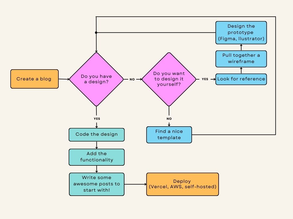
Before the actual coding
A lot of developers make the mistake of going right into the code, and unless you want to get trapped in a loop of corrections, redos, and revaluations, it is better to start off with a design. If you're not confident on your designer skills, there's a lot of nice blog templates out there! Elementor, Wordpress and Dribble are great choices when looking for one.
If you are in touch with your artistic side then that means you'd want to create a design of your own, how to design a blog goes beyond the scope of this article, but here are some tips to keep in mind when doing so:
- Inspiration! Look up other people's blog and think about the details you find attractive, then transform them into something new, like a good book once said, almost everyone creates their work out someone else's.
- Make a lot of drawing about how you'd like it to look, The distribution of the layout, the general esthetic, etc.
- More often than not, is better to go for a simpler design, the users wouldn't want to be drowned in icons and animations when reading your posts.
What are we building?
I found this nice template in worpress to get us started. It incorpores all you'd expect for a blog, perfect for our use case.

Creating the project
Now let's get started, open a terminal wherever you'd like to create a next project, this can be accomplish using the create-next-app npx command like so:
If it prompts you to install create-next-app, type yes and then press enter, the command will walk you through several options to customize your project. For this demo this is our configuration:
- For typescript, select No.
- For ESLint, select Yes, this will detect errors in our code so we can fix them right away.
- For TailwindCSS, select Yes.
- For the
srcdirectory option, select Yes. - For the experimental
app/, select No, - Finally, press enter for the
import aliassince we want the default.
This command will create a folder with the name you set up, in this case blog-example, with all the dependencies. At first glance all the files can be intimidating, so let's break it down:
- node_modules: Here's where your dependencies are going to be stored.
- public: All the static assets (images, videos, icons, etc) that you want to serve are going to be stored here.
- src: The code we're going to write will be stored here.
- pages: Here's is where we are going to define our page components, NextJS uses the file system to determine the routes of our pages, making our job a lot easier, but that also means it can't follow the standard "React" way of calling component files.
- api: A folder where we can set up api routes, since we will create a static blog we can skip this one.
- styles: The css that we write goes here, you probably have noticed there's some default styles here.
- pages: Here's is where we are going to define our page components, NextJS uses the file system to determine the routes of our pages, making our job a lot easier, but that also means it can't follow the standard "React" way of calling component files.
- .gitignore: This file allows us to ignore certain files when uploading to github.
- jsconfig.json: A config file to define the options of the javascript project.
- package.json: This file is where our dependencies and project commands are defined.
- postcss.config.js: The config file for PostCSS, we will not bother that much about this one.
- tailwind.config.js: The config file for tailwind, this is where we are going to set our custom values for such things as colors, sizes, fonts, shadows, etc.
blog-example folder and type npm run dev, if you go to the url it prints you should be seeing something like this:
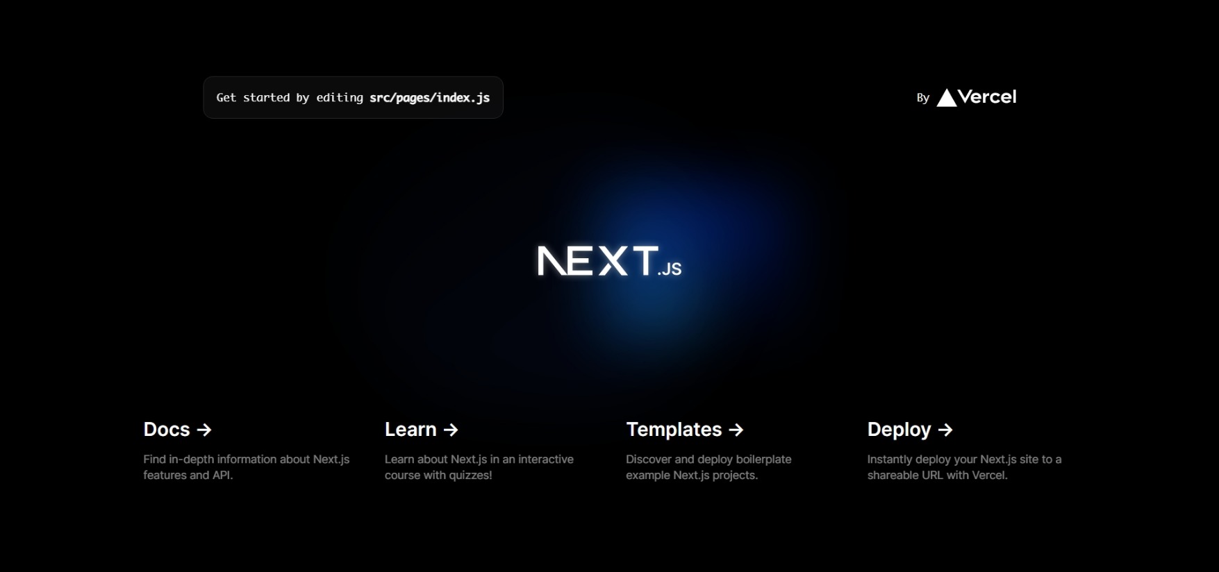
Since we are not going to use anything from the default page, let's delete the following:
- delete the
apifolder insidesrc. - Go to index and delete the imports, the
interfont declaration and everything inside thereturnkeyword. The file should look like this:
- Delete everything inside the
globals.cssfile, except from the 3 first lines. The file should look like so:
If you did everything right, the linter should be warning us about an error in index. The problem is that our function is not returning anything at all, so let's change that! go ahead and type something like:
Very nice! although it doesn't look anything like our design, let's change that!
TailwindCSS configuration
One of the nice features of tailwind is the customization, when working with a new tailwind project always make sure of adding the colors, sizes, shadows, etc., from your original design so that we can't get custom-made classes. In this case, the only aspect that we have to change is the font, our design uses the Segoi UI font, let's apply that to our tailwind.config.js:
What we did:
- We used the
extendproperty of theme, which means that we want to extend the original styles, instead of override them. - We used the
fontFamilyproperty, since we want to add our own font. - We selected
sanssince our font is sans-serif. - And finally we specified that our font is going to be Segoe UI.
If everything is correct, we should see our font change now.
That's all for the tailwind configuration, now let's finish the homepage, it should look like this:
Which gives us the next result
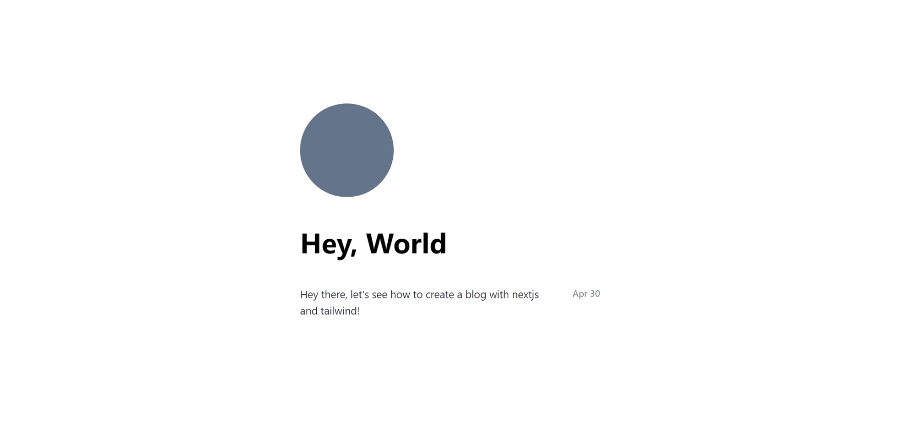
Okay hold on for a second, what did we just do? Where did those classes come from? This is where the power of tailwind really show up, as you can see, it generated all those clases automatically, the best part is that tailwind is able to detect which classes are we using, and it only ships those with our website, leaving us with a really small css size. You probably realize, the names of the clases maps to certain css properties, for instance, grid refers to display: grid;, m-auto maps to margin: auto; and classes such as w-screen points to width: 100vw;. At the end of the day, is like writting css in our code directly, without having to think about clever names, which really boosts productivity. If you have any doubts about a class, you can look up the Tailwindcss Docs and just type the class you want to check out.
Now, it would be nice if we could make that article item into a component, let's abstract the logic there into a react component.
In this component we import the Link component from the next/link library, this component allows us to move between our pages, without a full reloading of the page. It's really similar to a normal a html tag, and it even renders as such, you probably have noticed that we give it a route of "/" + slug, this will come into play later on.
You probably have already noticed, but tailwind gives us some nice modifiers to interact with pseudo-classes such as hover, which we are using to implement the underline hover effect.
And now, before updating our home page, It would be nice to have some data to test our page. If you already wrote some content you can use that, but if not, you can go ahead and copy paste the next function, which gives us a random post. I stored this function in a file called utils.js in a src/lib/ folder I created.
Go ahead and change the homepage so it can render our new awesome post
So, in summary, we just:
- Created an state where our articles are going to be stored.
- Used useEffect, so we can set our articles without causing any loops.
- Inside, we create an empty array with a length of 4, fill it with nulls and then map then into randomly generated posts!
- We mapped our articles to an ArticleCard component, when doing a list of components it a good practice to always add a key, in this case the title, and then we setted the title and date using destructuring
...assignment.
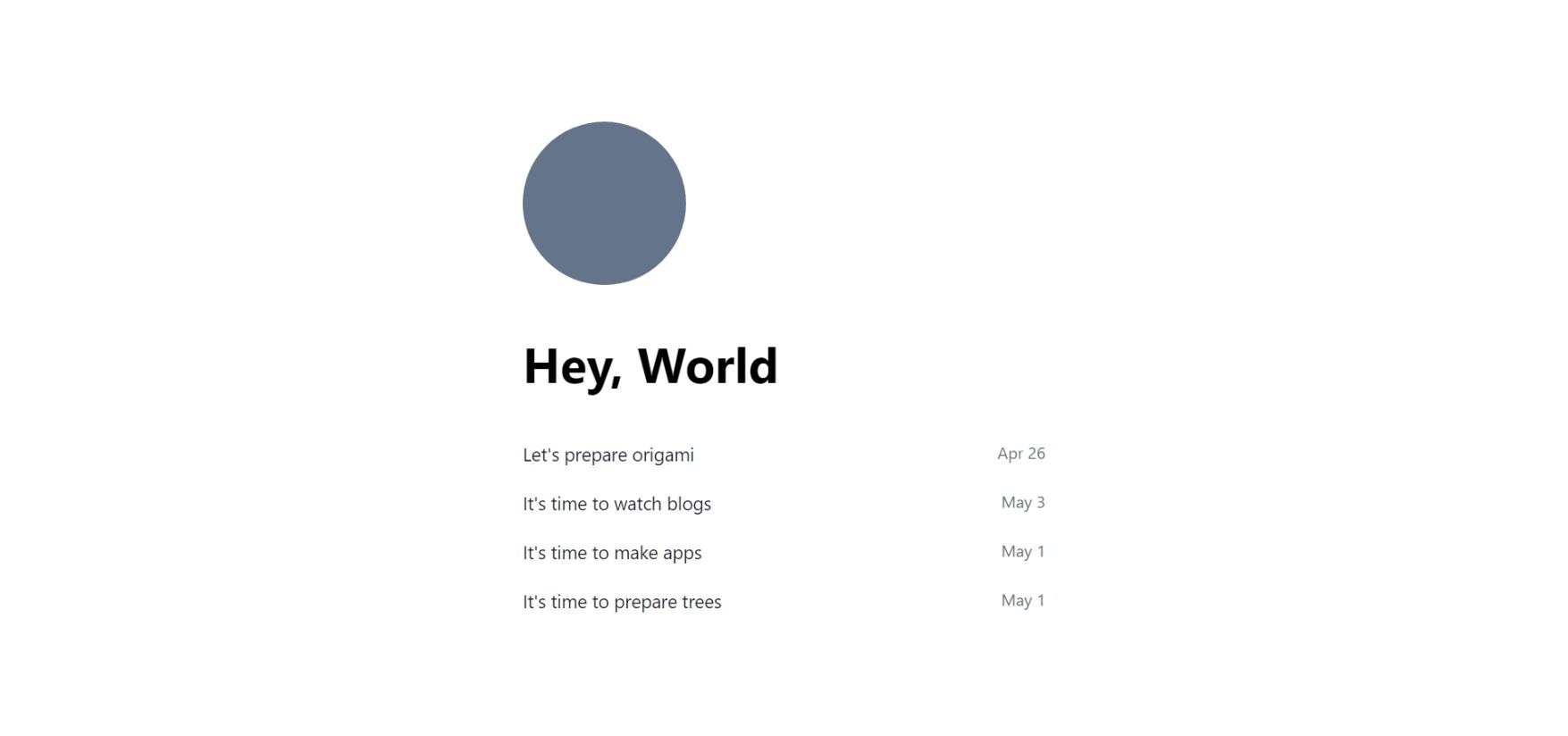
Hop up back to the browser, you should see something like this:
Well, that was a lot of work, and we haven't created the actual article page! But the next steps are really straighforward:
- We have to create the article page.
- Add some dummy articles so we can do some tests.
- Implement getStaticProps in the home page
- Add getStaticProps and getStaticPaths in the article page, I'll explain shortly them both.
Sooo, let's cross out the first step. Create a file under pages with whatever name you'd like (we'll change it later), for now I will call it article.js and add the page.
In the browser, go to the searchbar and add /article to the route, you should find our article page:
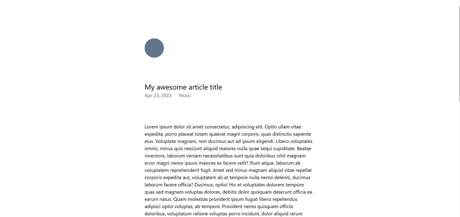
But yeah, it would be rather teadious if we had to create pages for every single article. We would like to access an identifier that pointet to an article, and using such data to populate the page. Thankfully, NextJS routing gives us that functionality. go ahead and change the filename of article.js into [slug].js. If you do so the page in localhost:[port]/article will still be visible, actually, any string you add after the slash is going to point to our article page. What's happening is that NexJS takes that portion and passes it into our page component, with the name we specified (in this case, the variable is going to be slug).
It would be nice to map the slug with the articles, so go ahead and create a folder in the root of the project (blog-example) with the name "articles". This is the folder that is going to contain our markdown files, if you have any of your own you can put it there, but if not don't worry, in the repository of this project you'll find some dummy markdown files for testing.
Now there are some pieces left for our article-reading:
- A way to get the files.
- A way to read these files.
- And finally some way to transform the content of the files into data.
To achieve this, we're going to use these two libraries:
- Gray-Matter: This text processor allows us to get the metadata inside the markdown files, we used this to get the slug, the title, the date and the category
- React-Markdown: This library gives us a nice react component that parses markdown content into html.
Open a terminal and type next command:
Create a file in the lib folder inside src called articles.js, we will store all our article related functions here. We just need 3 functions:
readArticle(path): This functions returns the contents of an article given a path.getAllArticles(): Get all articles in the article folder.getArticlesBySlug(slug): searches through all articles and returns the one with the given slug, orundefinedif it doesn't exist.
The implementation looks somewhat like this:
Here we are:
- In
readArticle(path)- Using the fs library to read the raw contents of the file.
- Using the matter function in gray-matter to transform the contents of the file into an object.
- Returning an object with the metadata and the content.
- In
getAllArticles()- Using the fs library to read each path inside the articles folder
- Map through each path, and using our
readArticlefunction to return the article for each given path. - Returning the article array.
- In
getArticleBySlug(slug)- Using our
getAllArticles()function to get all articles - Using the find method to search for an article with the given slug.
- Returning either a valid article or undefined.
- Using our
Now we're all set! All that's left is to introduce you to some NextJS concepts:
getStaticProps: An asynchronous function that only a page can export. It tells nextJS that a page is going to contain static data from somewhere, it can be the file system, an api, etc., and pass it to the page via the props.getStaticPaths: This asynchronous function allows us to compile dinamic pages ahead of time, this will tell nextjs which pages we want to prerender so our users can access them faster.
Let's test this new concepts with the home page.
Now as you can see some things changed:
- We implemented the getStaticProps function, in this function we call getAllArticles, you'll notice that we have to change the date into a json string, this is because nextjs will append a json with this information into our page, so it expects json-friendly data.
- Then we return the articles in an object with the
propskeyword - In our home component, we can get rid of the useState and the useEffect, because we are already receiving the data from the get-go, we destructure the
propsbecause we only want the articles. - In the
ArticleCardwe now get all the data such as the title and date from the metadata property for each article, and we transform the date string back into a native javascript date type. - Remember when i told you that our slug will come into play later? as you can see, we are passing our slug into the links, so they can point towards each individual post.
If everything is right, you should see a page similar to the one we had before, but with the information from the articles folder.
And that's about it, all that's left is to finish the article page, which is fairly simple.
Now as always, let's break this code into pieces:
- We are exporting an asyncronious function called getStaticPaths
- This function is going to render our pages in build time, that is to say that nextJS will run getStaticProps for each slug that we pass.
- This has to come in the form of an param object, for each page, that has a slug property.
- At the end, we return this array of params in an object, under the
pathsproperty
- We export an async function called getStaticProps, that receives a
context- We get the "slug" from the params variable, nextJS gives us this slug portion under the
paramsproperty in the context - We search for an article with the same slug, if we don't find one then we return an object with the
notFoundproperty set to true- This will tell NextJS to throw a notFound error and show a 404 page.
- If we do find one, we return it with an object under the
propsproperty, like we did earlier in the home page.
- We get the "slug" from the params variable, nextJS gives us this slug portion under the
- We now replace our mockup data with the actual data, get the day, month and year from the date and set it like so.
And this is our final product:
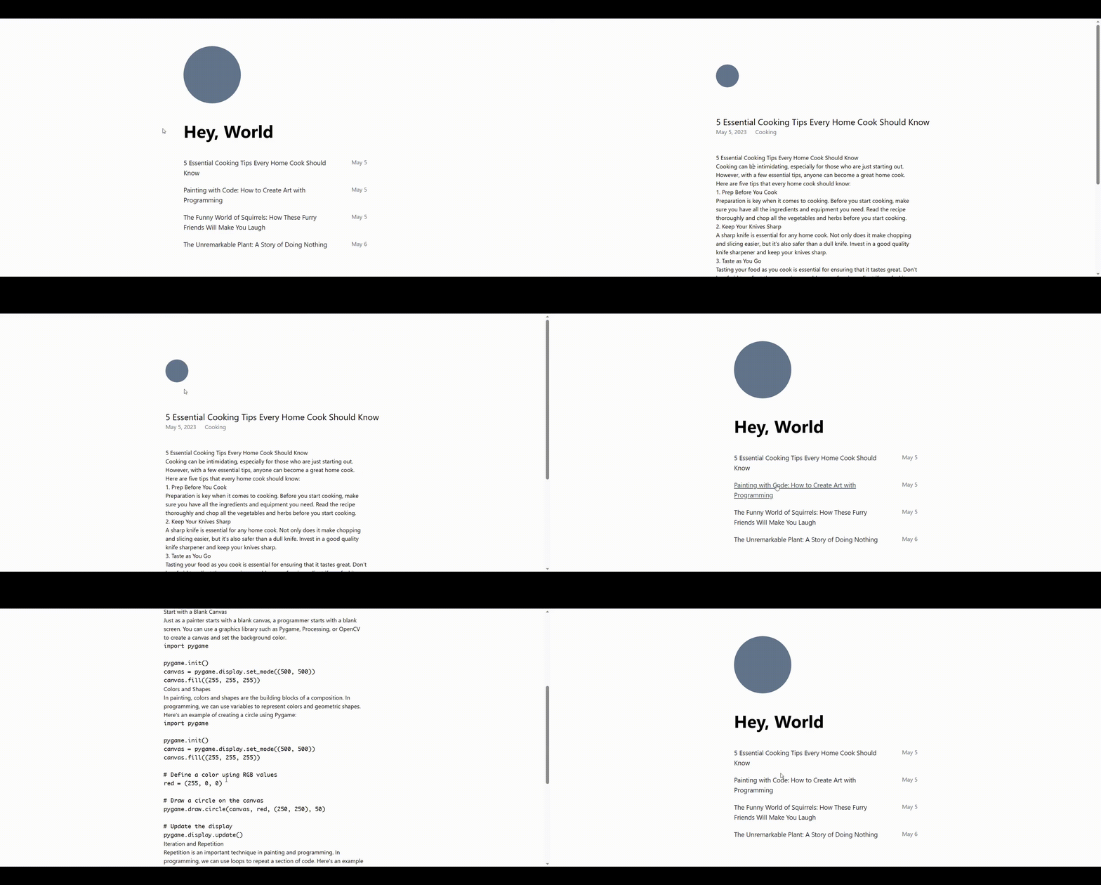
There's, of course, room for improvement, you could customize and extend this project even further by:
- Implementing a markdonw style sheet, for a project like this, Tailwind Typography is a really good option.
- Adding your own markdown components to
react-markdown. - Adding the next and previous buttons of the original design.
- ...And so much more!
If you ran under any problems while following the tutorial, be sure to check the repository for this project.
Conclusions
In this article we learned the basic tools that NextJS gives us to create a really nice and dynamic website, such as the static rendering and the file system rouing. We also implemented Tailwind, a library that allowed us to adapt our website to the design in a matter of minutes, without having to deal with horrible name conventions and bloated css.
I hope you found this article helpful.

